Data Center Networking
Data center networking is the networking infrastructure and technologies used to interconnect servers, storage systems, and other networking devices within a data center facility.
Artificial Sun. A robotic hand of AI carrying a high and clean energy ball that sustains a nuclear fusion reaction and generates hot plasma
Data Center NetworkingHow AI, Energy Requirements Are Shaping Data Center InvestmentHow AI, Energy Requirements Are Shaping Data Center Investment
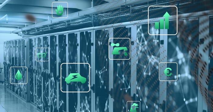
As Microsoft invests $80 billion to build out AI-powered data centers, tech companies face energy challenges in the cost of AI infrastructure.


Editor's Choice


SUBSCRIBE TO OUR NEWSLETTER
Stay informed! Sign up to get expert advice and insight delivered direct to your inbox